
Have you ever loved a lipstick in its tube, only to see it turn orange once applied? Getting the best lipstick colors for skin tone right means matching two things at once: the warm, cool, neutral, or olive cast under your skin, and the natural pigment of your lips.
Below is the shade-family map for every undertone, the nude-by-depth rules that actually work, a 4-step test for reds, and the real reason shades morph on your lips.
The right lipstick for skin tone starts with two inputs, not one: your undertone family (warm, cool, neutral, or olive) and your natural lip color. A useful starting point is to compare warm, cool, and balanced shade families while also checking your natural lip color, desired contrast, and formula opacity. For everyday nudes, start close to your natural lip depth or slightly deeper rather than following a fixed rule. If a shade looks wrong, check four culprits before blaming your skin: the product’s base, your natural lip pigment, the lighting, and the finish.
Not sure which undertone family you’re in? Start with the complete guide to, finding your skin undertone — the guide compares several imperfect clues plus a real foundation swatch — none proves undertone alone, but together they settle most of the guessing below.
Let’s Start With Undertone + Lip Pigment
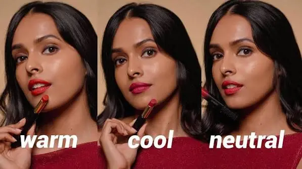
Most lipstick guides ask one question — “what’s your skin tone?” — and that’s why most of them fail. Two women with the same fair skin can take one nude in completely opposite directions: on warm undertones it reads honeyed and polished; on cool undertones it goes orange.
And two people with the same undertone can see different results because natural lip color varies. This is especially noticeable with sheer or semi-sheer lipsticks.
The decision rule that fixes this:
Find your Undertone Family First
Warm (golden/yellow cast), cool (pink/red cast), neutral (a balanced mix), or olive (a green-golden cast that doesn’t fit either). If you’re unsure, start with the skin undertone and foundation comparison guide. Jewelry and vein observations are limited clues, not definitive tests, and you don’t need a perfect undertone label to choose lipstick.
Read your Natural Lip Color
Remove existing lip color and examine your natural lips in indirect daylight. Notice whether they appear pink, mauve, brown, rosy, peachy, or a mixture. Your hand can help demonstrate the product’s color, but it won’t necessarily predict how the lipstick will look on your lips.
In my salon, I’ve seen lipstick that looks rosy in the tube read peachier or muddier on naturally cool-leaning lips. It’s one reason I compare the shade on the lips rather than relying on its appearance in the packaging. Natural lip color varies within every undertone family.
Natural lip color can influence the final appearance, particularly with sheer or translucent products. More opaque lipsticks may conceal much of the natural lip pigmentation. For example, Lisa Eldridge notes that her Muse lipstick may appear cooler on naturally bluish lips and warmer on redder lips.
Match the product’s pigment base, not just the shade name
Hold a candidate next to an obviously orange lipstick and an obviously berry one. If it leans toward the orange, it’s warm-based; toward the berry, cool-based. Warm bases flatter warm undertones; blue-leaning bases flatter cool ones. Neutral undertones can explore warm, cool, and balanced lipstick colors. Choose depth and intensity according to the effect you want rather than avoiding vivid shades.
Judge the finish last, but judge it
Matte formulas read deeper and drier — they intensify mismatches. Satin and sheer formulas forgive. If you’re unsure about a shade family, test it in a satin finish first.
Why Lipstick Looks Different on Your Lips
Have you ever loved a lipstick swatch on your hand, only to find that the color looks completely different once you apply it?
Your natural lip pigmentation is one possible reason. Lips may naturally appear pink, mauve, brown, peachy, or purplish. When you apply a sheer or semi-sheer lipstick, that underlying color can influence the final result.
For example, a soft rose lipstick may appear cooler on naturally mauve lips and warmer on lips with more visible red or peach coloring. Before replacing a lipstick that looks wrong, compare its color in the tube, on your hand, and on your lips.
Check whether the formula is sheer or opaque, and examine the result in indirect daylight. If it appears too orange, try a less peachy or more muted version. If it looks too grey, compare a shade with a different pigment balance or depth. The goal is to understand what changed visually before buying another lipstick.
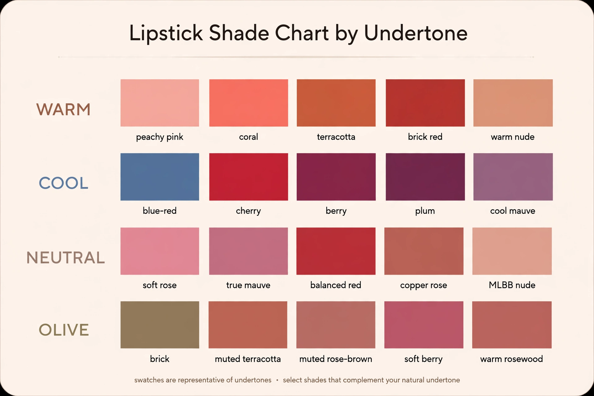
| Your undertone | Your best shade families | Go careful with |
|---|---|---|
| Warm | Peachy pink, coral, terracotta, brick red, orange-red, warm nudes | Ashy mauves, blue-purple, chalky pale pinks |
| Cool | Blue-red, cherry, berry, plum, cool mauve, rosy nudes | Orange-based reds, yellow-pink corals, frosty beige |
| Neutral | Soft rose, true mauve, balanced reds, MLBB nudes | White-based pastels, extreme warm/cool ends |
| Olive | Brick, muted rose-brown, muted terracotta, soft berry | Neon brights, gray-tinted nudes, stark blue-red |
Best Lipstick for Warm Undertones?
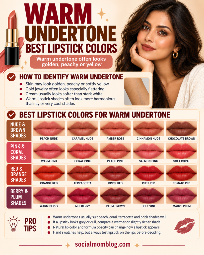
Warm undertones take heat beautifully — peach, coral, and orange-red can create a harmonious effect, though these colors are not limited to warm undertones. Build your rotation around:
- Everyday: peachy pink, warm terracotta, caramel-rose nudes
- Bold: brick red, tomato/orange-red, warm cherry
- Evening: burnt sienna, warm plum (the ones with brown, not purple)
The classic warm-undertone failure is the ashy nude: grey-beige nudes can look ashy on some warm complexions depending on their lightness and opacity. If a nude lipstick looks grey, pale, or washed out, check its depth, undertone, and opacity. A warmer shade may help, but a slightly deeper or less opaque nude could also improve the result.
What to Do When a Warm Nude Lipstick Looks Ashy?
Warm undertones don’t guarantee that every beige, peach, or brown lipstick will look natural. A nude may appear grey, pale, or washed out because its depth, pigment balance, or opacity doesn’t work well with your natural lip color.
If a beige nude looks too flat, compare it with a peachy-rose, caramel-rose, warm pink-brown, or muted terracotta shade. For fair warm complexions, a softer peachy-pink or warm rose can be a useful starting point. Medium and deeper warm complexions can also explore richer cinnamon, caramel-brown, or warm rosewood shades.
Don’t assume the solution is always to choose a warmer lipstick. Sometimes a slightly deeper shade, a sheerer formula, or a coordinating lip liner produces the result you want. Test your closest options in natural daylight and compare them with your natural lip color before deciding.
Best Lipstick for Cool Undertones
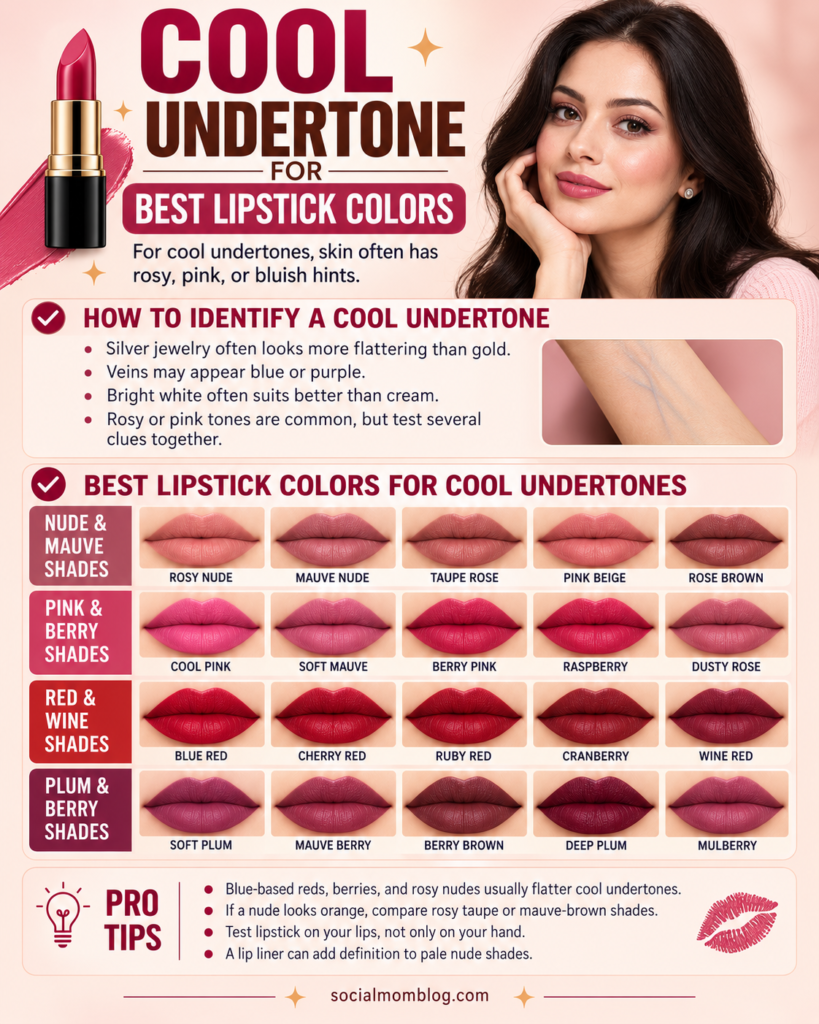
Blue-based reds, berries, plums, and rosy nudes are useful starting points for cool undertones. Warm reds and peachy shades can also work when you want a contrasting effect.
Cherry red, blue-red, berry, plum, and mauve are your power shades — and here’s the one pick that changes everything: Blue-based reds can create an optical contrast that makes teeth appear brighter for some people. They don’t physically whiten teeth, and the effect depends on the exact lipstick shade, lighting, and natural tooth color.
If a nude lipstick appears peachy-orange on cool-leaning coloring, compare the product’s warmth and depth with the natural lip color. A too-peachy shade, sheer coverage, or the surrounding makeup can all affect how it looks.
In my salon, when a nude looks more orange than intended, I compare rosewood, rosy taupe, or mauve-brown alternatives at a similar depth. I judge the result on the lips, not just from the shade name.
For an everyday cool-leaning MLBB (my lips but better), start with a rosy shade close to your bare lip depth or slightly deeper. Compare frosty beige or coral shades on your lips rather than ruling them out automatically.
How to Fix a Nude Lipstick That Looks Orange or Grey?
If your nude lipstick looks more orange or grey than expected, don’t give up on nude shades entirely. Start by identifying what looks wrong.
- If your nude looks orange: The lipstick may have more peach, coral, or warm brown pigment than you expected. Try comparing it with a muted rose, rosy taupe, mauve-brown, or neutral pink-brown at a similar depth.
- If your nude looks grey or ashy: Check whether it’s too light, too muted, or too opaque for your natural lip color. A slightly richer rosewood or mauve shade may give your lips more definition.
- If your nude looks too purple: Try a softer rose or a pink-brown shade with less violet influence. Natural lip pigmentation matters, especially when you’re wearing a sheer or semi-sheer formula.
If you love the lipstick’s color but it appears too pale, you can also experiment with a coordinating lip liner to add definition. Cool undertones are a helpful starting point, but the right nude is the one that creates the look you want on your actual lips.
Best Lipstick for Neutral Undertones
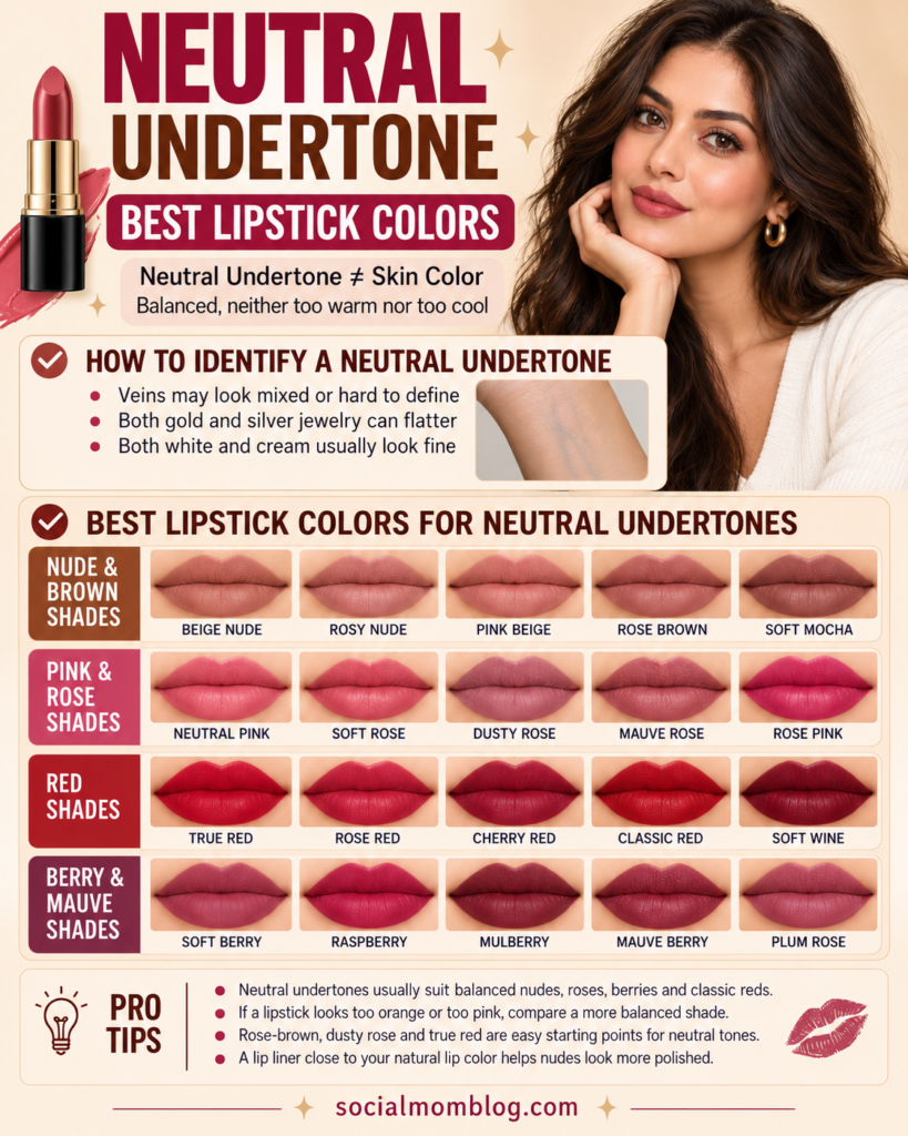
Neutral undertones offer plenty of flexibility, but shade depth, pigmentation, and the effect you want still matter. A neutral label doesn’t guarantee that every nude, red, or mauve will look the same on your lips. You can wear most things, but three types of lipstick that may need extra comparison:
- Pale opaque nudes. Very light, full-coverage nudes can look disconnected on neutral undertones when they differ substantially from the natural lip depth. If the result looks pale or washed out, compare a slightly deeper shade or a sheerer formula.
- Intensely warm or cool colors. A neon orange-red or a harsh blue-purple may need extra comparison on neutral undertones rather than being ruled out. If you love red, pick a balanced true red — not leaning brick, not leaning blue — and compare it with the bolder options.
- Shades that differ substantially from the natural lip depth. A lipstick much lighter, darker, or more contrasting than your bare lips may need extra comparison. For a mauve reference, MAC Mehr is a cool-leaning mauve-pink example (the manufacturer describes it as medium blue-pink) — one option to compare, not proof that a single lipstick suits every neutral undertone. Also consider soft rose, true mauve, muted berry, and copper-rose.
- A neutral MLBB starting point: compare a lipstick close to your natural lip depth or slightly deeper. Adjust its warmth, opacity, and depth to get the everyday look you prefer.
Best Lipstick for Olive Skin
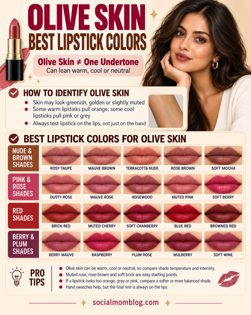
Olive coloring can be warm, neutral, or cool, and it may also appear relatively muted or vivid. This is why one lipstick recommendation won’t necessarily work for every olive complexion. In my salon, I’ve seen bright blue-based reds feel too intense on some clients with softer, muted olive coloring.
When that happens, I compare a softer, browned, or sheerer red rather than assuming the client needs to change undertone families. It’s a preference and intensity adjustment, not a rule for all olive skin.
Split olive by lean:
- Warm olive (golden-green): brick, terracotta, warm rosewood, caramel brown. Some cool-leaning nudes can appear grey on warm olive coloring, so compare them on the lips before deciding.
- Neutral olive (balanced green): muted rose-brown, soft mauve-brown, dusty rose. In my salon, I have worked with clients looking for a muted pink-brown that does not pull too pink or purple once applied. I compare rose-brown, mauve-brown, and dusty rose options on their lips rather than trusting shade names alone.
- Cool olive: explore cool berries, plums, rosy-browns, and blue-based reds. If brighter colors feel overpowering, try more muted or sheer versions, but don’t rule them out automatically.
Personal Experience
In my salon, I have seen a lipstick look quite different on the lips than on a hand swatch, particularly when the natural lip color shows through. A hand swatch can show the product color, but it cannot guarantee the result on the lips. To judge the most accurate color, test lipstick on your lips using your own product, a fresh sample, or a hygienically prepared tester with a single-use applicator.
Don’t apply a shared store lipstick directly from its bullet or applicator. I’ve also seen deeper lip colors appear pinker than expected on some golden-olive complexions. In that situation, I compare a browner or more muted option at a similar depth, rather than automatically choosing a darker shade.
For the full undertone breakdown this section builds on, see the warm vs cool vs neutral undertone guide (coming soon) and makeup colors for olive skin (coming soon).
An illustration of how finish changes the result: picture the same olive complexion wearing an opaque brick red — the full coverage creates a bold, high-contrast look — and then imagine the same complexion with a sheer berry stain, where the skin’s natural tone shows through for a softer effect. This is only a hypothetical comparison to show how opacity and finish matter, not a verified client result.
Nude Lipstick by Skin Depth
How to Select an Everyday Nude
Nude lipstick is often harder to choose than it looks, and shade depth is an important part of the decision. For an everyday nude, start with a shade close to your natural lip depth or slightly deeper. If it looks pale or washes you out, compare a deeper or less opaque option.
Your skin depth, natural lip pigmentation, and preferred finish all affect the result. A nude that is too similar to your surrounding skin can make the lips appear less defined, depending on its coverage.
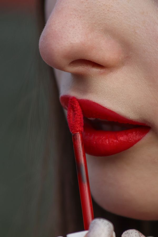
- Fair skin: Warm — honeyed nudes, peachy beige. Cool — rosy taupe, pale mauve. Avoid chalky pale nudes (they wash out) and anything your skin can see through to orange.
- Medium skin: Warm — caramel, terracotta-nude, warm cinnamon. Cool — rosewood, mauve-brown. This depth has the widest nude range; the main trap is going too pale, which reads concealer-lips.
- Deep skin: Warm — rich caramel, toffee, warm chocolate. Cool — deep berry-nude, espresso-plum. Sheer formulas can disappear on deep lips, so prefer satin or full-coverage finishes. Lighter nudes can also work with a compatible lip liner or a sheerer finish; if a shade washes you out, compare its depth and opacity.
A quick sanity check for any nude: When you have a hygienic sample, apply a small amount to your lips and examine the result in indirect natural daylight. If you can’t tell where lip ends and skin begins but your lips still have dimension, it’s the one.
Red Lipstick by Undertone
Red is where undertone rules pay off most visibly. Forget shade names for a minute and run this test:
The two-stick test. In the store, hold your candidate between one clearly orange-leaning red and one clearly blue-leaning (berry) red. Comparing a lipstick with a clearly orange-red and a clearly blue-red reference can help you judge whether it looks relatively warmer or cooler.
The comparison is visual rather than a chemical measurement, and similar depth and lighting make it more useful. Use one warm red, one balanced red, and one cool red as examples — MAC’s Ruby Woo is a vivid blue-red per the manufacturer, making it a reasonable cool-red reference. Then:
- Warm undertones: lean into the orange side — brick red, tomato, warm cherry, terracotta-red. Revlon’s Bread Winner (ColorStay Suede Ink, 016) is a drugstore deep crimson red name that keeps coming up in fair-skin roundups (poorlittleitgirl.com).
- Cool undertones: lean into the blue side — blue-red, cherry, raspberry-red, berry-red. Blue-reds flatter cool skin — the widely cited NARS Dragon Girl is a classic blue-leaning bright red. Blue-leaning reds may make teeth appear less yellow by contrast for some wearers; results vary.
- Neutral undertones: pick the middle — true red, balanced cherry. Balanced reds are a useful starting point for neutral undertones, but bright orange-reds and vivid blue-reds can also look beautiful.
- Muted complexions (any undertone): browned reds, soft brick, and muted cherry can create a gentler effect. Vivid reds are also an option when you want more contrast.
And the fair-skin footnote: fair cool skin takes blue-red beautifully, but if you find classic reds too stark, a sheer cherry stain gives the same payoff with less contrast. For how red interacts with the rest of your face, matching foundation to your undertone (coming soon) keeps the base from fighting the lip.
How to Test Red Lipstick Before Choosing Your Shade?
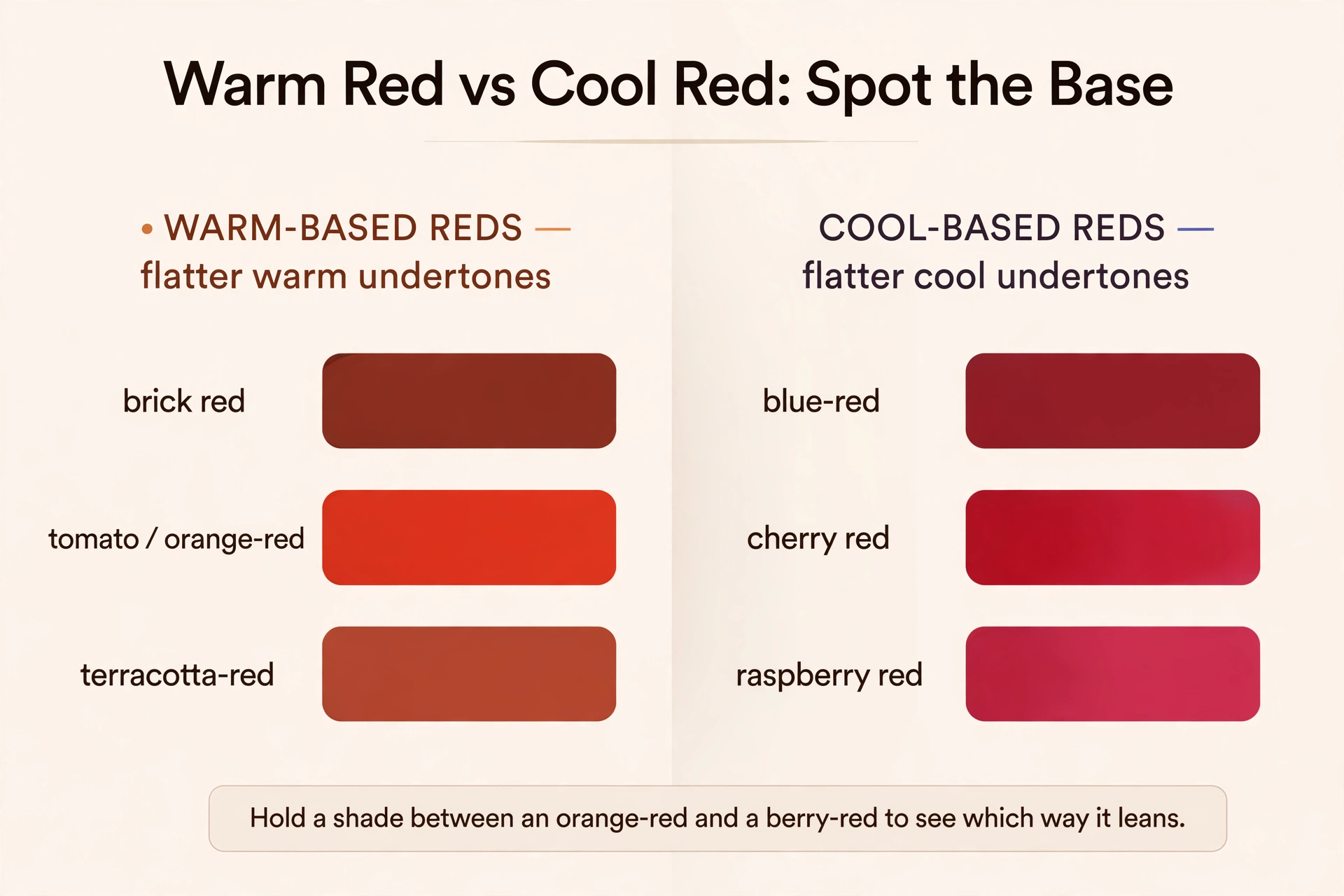
Red lipstick can look very different on your lips than it does in its packaging. That’s why choosing the right red involves more than deciding whether your undertone is warm or cool.
Start by comparing three red color directions: an orange-leaning red, a relatively balanced red, and a blue-leaning red. If you’re testing products in a store, avoid applying shared lipstick directly from the tube. Use a fresh personal sample or an appropriate hygienic single-use applicator. Apply your chosen shade evenly to your lips and examine it in indirect natural daylight.
- Check the color. Does it appear red, orange, pink, or more purple than expected?
- Check the intensity. If the shade looks too bright, compare a muted red, a deeper version, or a sheerer application.
- Check the overall look. Consider the lipstick alongside your skin, natural lip pigmentation, and the rest of your makeup.
- Check the finish. A full-coverage matte red and a sheer red stain can create very different results, even when their colors are similar.
If you’re unsure between two shades, compare them under the same lighting conditions and choose the effect you prefer. Warm undertones can wear blue-based reds, cool undertones can wear orange-reds, and olive or neutral complexions can explore both. The best red lipstick isn’t determined by one undertone rule. It’s the shade that looks right to you when you actually wear it.
Why a Shade Changes on Your Lips?
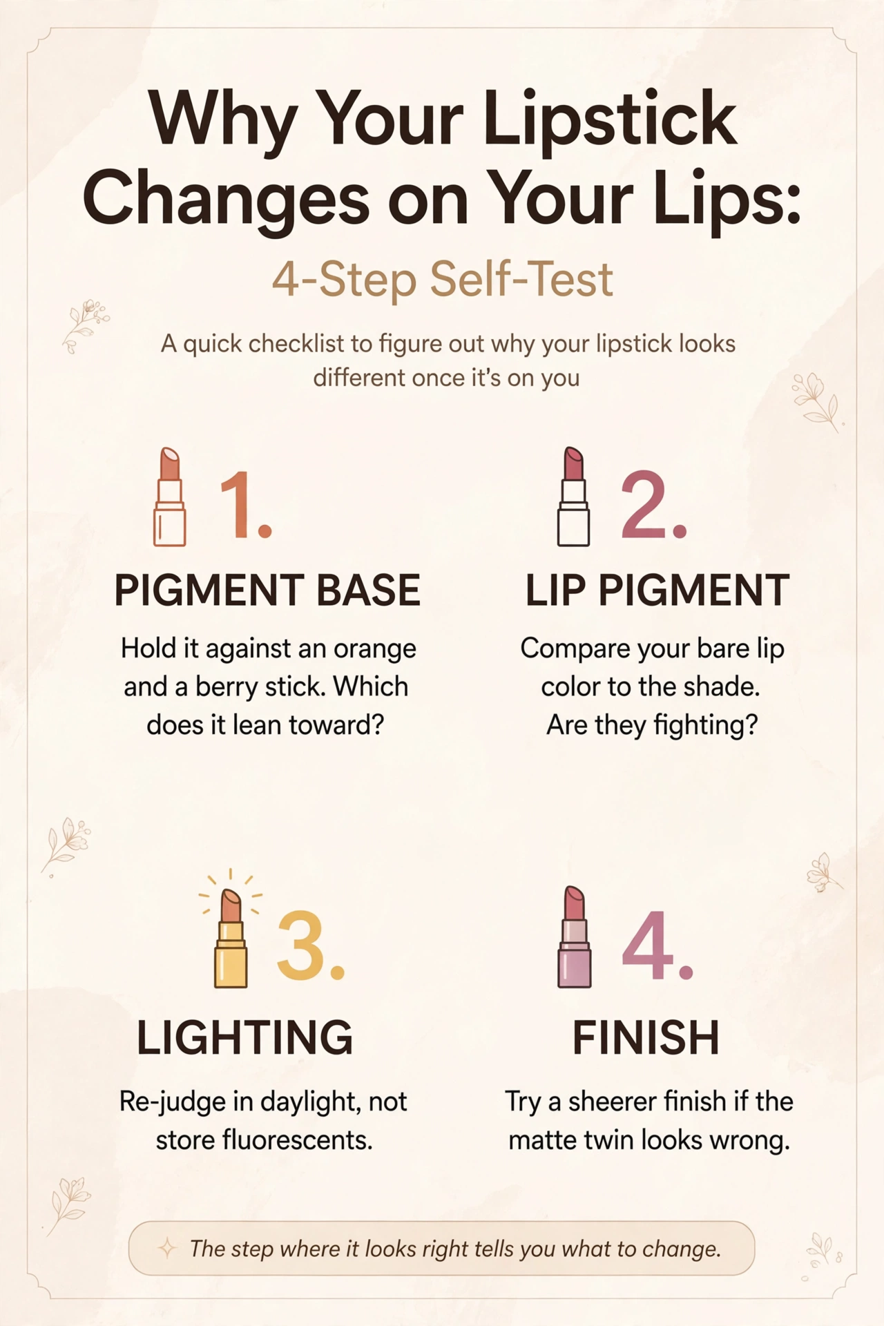
This is the question behind every “why did this turn orange on me” — and four factors are worth checking together. Here they are:
1. The product’s pigment base. A lipstick may look warmer or more orange than expected because of its pigment balance, opacity, and the natural lip color underneath. Comparing it with a rosier or less peachy shade at a similar depth can help narrow down the reason.
2. Your natural lip pigment. Lips aren’t a blank canvas. Berry-toned lips deepen everything; peachy lips warm everything; purplish lips cool everything down. In my salon, I’ve seen a color look like a soft rosy pink against the cheek yet appear much brighter on the lips. I look at natural lip pigmentation and the product’s coverage before judging the shade.
3. The lighting. Store fluorescents flatten warm and cool alike; that “perfect” tube shade was judged under the worst possible light. Always re-judge in daylight or at least neutral white light.
4. The finish. Mattes concentrate pigment and read darker and more intense; glosses and sheers let lip pigment show through and read lighter. A shade that looks right in a gloss bullet can look wrong in its matte twin.
The 4-step self-test for any shade that looks wrong: (1) hold it against an orange and a berry stick — which does it lean toward? (2) compare your bare lip color to the shade — are they fighting? (3) check it in daylight; (4) try the same shade in a sheerer finish. These comparisons can help narrow down why a lipstick looks different than expected, but they don’t prove a single cause. Change one variable at a time—shade, depth, opacity, or lighting—so you can better identify the result you prefer.
| If your lipstick looks… | Check first | Try next |
| Too orange | Warmth or peachiness in the shade | Compare rosy, muted, or cooler options |
| Too grey | Pigment balance, lightness, opacity | Try a richer nude or less muted color |
| Too pale | Depth compared with natural lips | Try a deeper shade or coordinating lip liner |
| Too purple | Coolness and natural lip pigmentation | Compare a warmer rose or brown-based shade |
| Too bright | Saturation and opacity | Try a muted version or apply as a sheer stain |
| Different from its hand swatch | Natural lip color, coverage, lighting | Test a hygienic lip application |
Lipstick Shade Chart: Lipstick for Skin Tone and Depth at a Glance
Use this table to compare lipstick colors across skin depths and undertone directions. Treat the suggestions as starting points, then adjust for your natural lip color, the formula’s opacity, and your preferred intensity.
| Undertone | Fair | Medium | Deep | Possible mismatch to check |
|---|---|---|---|---|
| Warm | Peachy nude, soft coral | Terracotta, caramel-rose | Brick red, warm chocolate | Ashy mauve, greige nude |
| Cool | Rosy taupe, pale mauve | Rosewood, cherry red | Berry, espresso-plum | Orange-red, yellow coral |
| Neutral | Soft rose, true mauve | Balanced red, copper-rose | Muted berry, rosewood | White-based pastels, extreme ends |
| Olive | Muted rose, soft terracotta | Brick, muted rose-brown | Deep brick, soft berry | Neon brights, gray nudes, stark blue-red |
FAQs
Conclusion
Choosing lipstick for your skin tone becomes easier when you compare shade warmth, natural lip color, pigment depth, and opacity instead of relying on a label alone. Warm, cool, neutral, and olive descriptions can guide your options, but the final result on your lips matters most.
Next time a shade morphs on your lips, run the 4-step self-test before blaming your skin — the difference may come from the shade, formula, natural lip color, or lighting. Ready to make the rest of your face match?
