
You’ve probably spent $40 or more on a foundation that looked flawless under the store lights — then horrifyingly orange in your car mirror on the way home. I want to help you stop repeating that expensive mistake. Learning how to find your skin undertone isn’t about one magic trick (forget everything the vein test alone told you).
A few practical comparisons in natural daylight can help you narrow down your undertone and find a more reliable foundation match. By the end, you’ll know whether you’re warm, cool, neutral — or part of the famously tricky olive family — and you’ll have a more reliable way to compare shades before your next foundation purchase.
How to Find Your Skin Undertone
Start by comparing two to four foundation shades at approximately the same depth but with different undertones. Apply separate swatches along your jawline and compare them with your neck and visible chest in indirect natural daylight.
Allow the foundation to set before judging the result. The shade that creates the most natural transition is a promising match, but you should also check its depth, formula, and appearance during wear.
You can explore white-versus-cream fabric comparisons and jewelry preferences as supporting clues. However, these observations don’t reliably determine undertone on their own.
If your results are mixed, compare neutral, muted, or olive-friendly shades rather than forcing yourself into one category.
Skin Tone vs Undertone: Know the Difference First
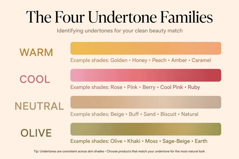
Here’s the confusion behind most shade mistakes. Skin tone is the surface color — light, medium, tan, deep. It changes with the seasons. Skin undertone is the subtle hue underneath — warm (golden, peachy), cool (pink, rosy), neutral (a balanced mix), or olive (greenish-golden). It is usually much more stable than surface skin tone, though lighting, tans, and skin changes can alter how it appears.
Two people can share the exact same medium skin tone, yet one looks flawless in a golden-beige foundation while the other looks masked — because their undertones are opposite. Many foundation ranges use numbers to indicate approximate shade depth and letters or descriptions to indicate undertones, but the naming systems vary by brand and formula.
Always check the manufacturer’s description of the exact shade instead of assuming that W, C, N, NC, or NW have universal meanings. For example, in MAC’s Studio Fix line, NC shades suit golden/yellow-warm skin while NW shades suit pink/rosy-cool skin — the reverse of what the letters suggest — and this convention does not transfer to other brands.
Why the Right Foundation Depth Can Still Look Wrong
Two people can have a similar skin depth and still need completely different foundation shades. Imagine two people with medium skin. One has a golden-looking complexion, while the other has a more neutral or rosy undertone. A foundation may match both people’s skin depth but blend naturally on only one of them. This is why choosing foundation by shade number alone can lead to a mismatch.
Start by identifying your approximate skin depth. Then compare foundations with different undertones at a similar depth. Apply separate swatches along your jawline and check how they blend with your face, neck, and visible chest in indirect natural daylight.
If one foundation looks too pink or yellow, don’t immediately move to a lighter or deeper shade. First compare a different undertone at the same approximate depth. The goal is to find the right combination of depth, undertone, and formula rather than relying on one shade label.
Your face and neck don’t always look exactly the same. Sun exposure, visible redness, and uneven pigmentation can make your face appear warmer, pinker, or darker than your neck. That’s why choosing foundation based only on how light or deep your face looks can lead to a noticeable mismatch. Compare your face, jawline, neck, and visible chest together.
A good foundation match should create a natural transition between these areas instead of matching one area perfectly while looking disconnected from the others. First rule of this guide: match the depth to your tone, but match the formula family to your undertone.
Warm, Cool, Neutral, and Olive: Understanding the Differences
| Undertone Category | Key Visual Characteristics | Foundation Labels to Look For | Shade Selection Guidance |
| Warm | Golden, honey, peachy, or amber hues. | W, “Golden,” “Honey,” “Peach” | Choose golden, peach, or warm-based shades. Avoid strong pink base tones. |
| Neutral-Warm | Slightly leans golden/warm without extreme yellow undertones. | Neutral Warm, Warm Neutral; check exact brand shade description | Compare neutral and gently warm shades for a seamless, subtle warm match. |
| True Neutral | A balanced mix—neither distinctly golden/yellow nor pink/rosy. | N, “Neutral,” “Classic” | Compare balanced neutral shades that balance warm and cool pigment. |
| Neutral-Cool | Softly rosy or pink-leaning without intense blue/red tones. | Neutral Cool, Cool Neutral; check exact brand shade description | Compare neutral and softly rosy shades for a natural cool tint. |
| Cool | Rosy, pink, or bluish undertones (independent of surface redness). | C, “Rose,” “Porcelain,” “Pink” | Choose rosy or cool shades. Avoid strong yellow or orange bases. |
| Olive | Muted greenish or grey-green influence; can lean warm, cool, or neutral. | O, “Olive,” “G” (Green/Olive) | Look for olive or muted shade lines. Standard warm turns orange; cool turns pink. |
Warm leans golden, honey, peachy, or amber. Warm undertones are often described as golden, peachy, or yellow-based, but tanning and burning behavior should not be used to establish undertone. Look for labels like W, “golden,” or “honey.”
- Cool undertones are often described as rosy, pink, or bluish. They can appear at any skin depth, and surface redness doesn’t automatically indicate a cool undertone. Look for C, “rose,” or “porcelain.”
- Neutral is the balance — not clearly golden, not clearly pink. Neutral isn’t always a perfect midpoint. Some complexions lean slightly warm or cool without fitting comfortably into strongly golden or rosy shade families. In foundation shopping, you may find neutral-warm or neutral-cool options more natural than either extreme. These are shade-selection starting points, not proof of a biological classification. Actual brand labeling varies.
- Olive describes a muted, greenish, or grey-green influence in the complexion and can occur at different skin depths. Olive skin isn’t necessarily warm: some olive complexions lean warm, others cool, and others more neutral. This is why standard pink-versus-yellow foundation categories don’t always provide a good match.
Olive coloring can appear at fair, medium, or deep skin depths and may lean warm, neutral, or cool. Some olive complexions look relatively golden, while others appear muted or grey-green. Conventional foundation shades may look too orange, pink, yellow, or grey on some olive complexions, but these mismatches are not universal. Comparing shades at the same depth is more useful than relying on an olive label alone.
One caveat before the tests: overtone — surface redness, a tan, dullness — sits on top of undertone and confuses every check. That’s why the tests below read multiple body areas, not just your cheeks.
How to Determine Skin Undertone at Home? Use Several Tests, Not One
Honest truth most guides bury: every single undertone test has a failure mode. The vein test fails on deeper skin and olive undertones. The jewelry test fails if your style just skews silver. The white-shirt test fails under warm indoor bulbs. Use several clues, but don’t treat every test as equally reliable.
Start with foundation swatches to find a suitable base shade, compare warm and cool fabrics to assess color harmony, and use jewelry or vein observations only as supporting clues. If the results disagree, investigate the reason instead of forcing a majority verdict. Each takes about two minutes, ordered from most to least reliable.
Remove existing tinted makeup before testing. For foundation swatches, use your normal skincare and sunscreen once they’ve settled. Check the colors in consistent indirect natural daylight (face a window — never put your back to it), and compare against your neck and chest, not just your face.
Test 1 — Foundation Swatch Test
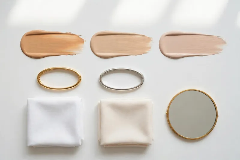
The heavyweight champion. Pick three shades at the same depth — one warm, one neutral, one cool — in roughly your tone. Swipe a short stripe of each along your jawline down toward your neck (not the back of your hand — hands tan differently and lie).
“Use your jawline as the starting point, then compare the swatches with your neck and visible chest. Aim for a natural overall match rather than choosing a foundation that matches only one area.”
Let each swatch set, then reassess after about 10–15 minutes — and again during wear if you are concerned about color-shifting. The wet color is not the final color. Then look straight-on in daylight:
- One stripe vanishes into your skin — that is your best candidate at that depth; verify depth and wear before deciding.
- An orange-looking foundation may be too warm, too dark, or simply the wrong formula. Compare it with a neutral and cooler option at the same depth before deciding.
- A visibly pink foundation may be too rosy. A grey or ashy appearance can have several causes, including an unsuitable shade depth, a muted pigment balance, or an undertone mismatch. Compare both depth and undertone before choosing another shade.
Three Foundation Swatching Mistakes Worth Avoiding
1. Choosing the shade that looks best immediately. Freshly applied foundation may look different after it sets. Some formulas become slightly deeper or warmer as they dry. Allow each swatch to settle, check it again after approximately 10–15 minutes, and consider a longer wear test before purchasing.
2. Testing shades with different depths and undertones at the same time. If one swatch is lighter, another is deeper, and a third is more yellow, it’s difficult to identify which difference matters. Start with shades at approximately the same depth but with different undertones. Once you’ve found a promising undertone, compare nearby depths.
3. Looking only at the center of your face. Redness, sun exposure, and pigmentation can make your cheeks appear different from your neck. Compare the lower face, jawline, neck, and visible chest together in indirect natural daylight. A successful match should create a natural overall transition, not simply disappear in one tiny area.
Test 2 — White vs Cream + Jewelry
Two micro-tests, one question: which “temperature” of things harmonizes with your skin?
Fabric test.
Hold pure bright-white fabric against your bare face in daylight, then swap it for cream. Notice whether white makes your skin look bright and clear while cream looks dingy, or cream looks smooth while stark white washes you out. Treat this as a color-harmony observation about which shades you enjoy wearing — not a definitive undertone classification.
Jewelry test
In the same daylight, hold gold against your skin, then silver. Compare gold and silver jewelry to explore which finishes you prefer against your complexion. You may find one more flattering or enjoy both equally, but neither result confirms your undertone. Use this as a styling observation rather than a diagnostic test.
Both good — neutral. Do it in daylight — warm indoor bulbs make gold flatter everyone — and treat it as one supporting observation among several. If both metals look genuinely good on you, that’s what one community guide calls the “neutral/olive confusion zone” — treat it as useful information, not a failed test.
Test 3 — Veins and Draping as Supporting Clues
- Vein test. Check the veins on the underside of your wrist in natural light. Wrist veins may appear blue, purple, or green depending on skin depth, lighting, and visibility. Because these appearances are inconsistent, vein color shouldn’t be used to classify your undertone or override a good foundation match. A supporting clue, not a final classification.
- Draping test. Drape a warm-toned fabric (mustard, camel) then a cool-toned one (icy blue, jewel tones) around your shoulders in daylight. Notice which fabric colors create the appearance you prefer. This can help you explore color harmony, but it does not independently establish your foundation undertone.
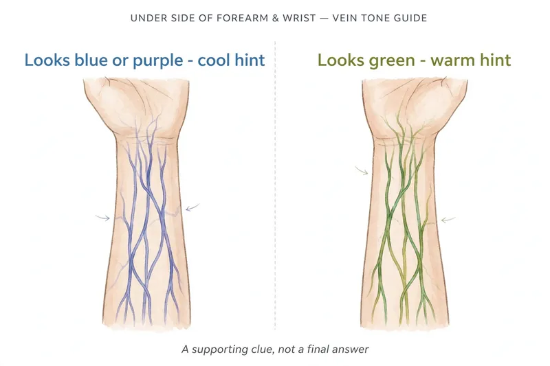
Both are supporting clues. Their job is to confirm or challenge what Tests 1 and 2 said.
What Your Wrong Foundation Is Telling You
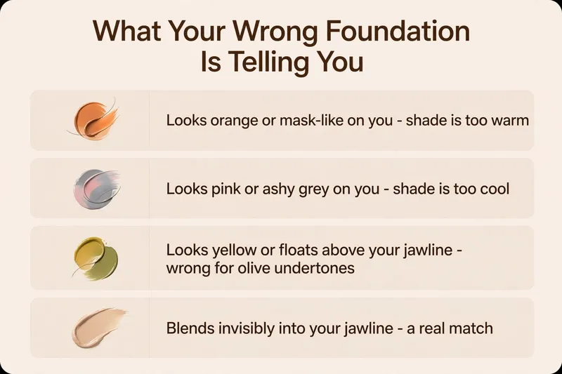
Already own a drawer of wrong shades? Read them before tossing them — each failure is a data point.
| What you see | Possible causes | What to try next |
| Orange | Too warm, too deep, overly saturated, or formula changes | Compare less warm shades at similar depth |
| Pink or rosy | Too much pink pigment | Try a less rosy alternative |
| Grey or ashy | Incorrect depth, muted pigment, undertone or formula mismatch | Check depth and pigment balance |
| Yellow | Too golden or yellow for your complexion | Compare more balanced shades |
| Changes after setting | Dry-down or product interaction | Recheck after setting and during wear |
| Looks good initially, wrong at home | Lighting, shade mismatch or wear changes | Compare in consistent daylight |
Could You Be Olive?
Olive undertones can be difficult to identify because standard warm, cool, and neutral descriptions miss their muted or greenish cast—leaving most people sensing something is “off” with their shade match.
Because olive exists across every depth (from fair to deep) and can lean warm, cool, or neutral, standard foundation labels repeatedly fail: warm formulas turn orange, cool ones look pink or chalky, and neutral shades pull gray against the jawline.
Recognizing your skin’s subtle yellow-green cast in natural light is the key breakthrough; if standard shade families constantly shift color on you, start searching within dedicated olive or muted ranges instead.
What to Check When Standard Foundation Undertones Don’t Work
If warm, cool, and neutral foundations all seem slightly wrong, olive or muted coloring may be worth exploring. However, repeated foundation mismatches don’t automatically mean your skin has an olive undertone.
Start by checking whether the foundations are genuinely close to your skin depth. Next, look at the type of mismatch. A foundation that appears too orange may be excessively warm or saturated. One that looks grey could be too light, too muted, or unsuitable in its pigment balance.
Some olive complexions appear more golden, while others have a neutral or subtle grey-green quality. This means the same olive-labeled foundation won’t suit everyone. Compare olive-friendly and muted shades alongside conventional undertones at similar depths. Check the results along your jawline, neck, and visible chest in indirect daylight.
If none looks natural, consider a different foundation formula rather than assuming your skin must fit one specific undertone category. An olive shade is another option to investigate, not an automatic solution.
Why Undertone Tests Disagree?
If your undertone tests disagree, check the testing conditions before interpreting the results. Mixed signals may reflect lighting, temporary surface redness, skin depth, muted or olive coloring, or limitations in the tests themselves.
- Surface redness (rosacea, irritation) adds pink overtone that skews reads cool — test the calmer neck and chest.
- A tan warms the overtone without changing the undertone — weight the jawline-swatch test more heavily.
- Lighting flatters: warm bulbs flatter gold and warm shades, cool fluorescents flatter silver; daylight is the only neutral judge.
- Mixed signals are normal — faces get more sun and redness than necks, so when your face, neck, and chest differ in color, choose the foundation that creates the most natural transition across the visible areas.
| Veins suggest warm, but foundation looks too yellow | Don’t use vein color to override the swatch |
| Face looks pink, neck appears more golden | Check for surface redness and compare calm skin areas |
| Gold and silver both look good | Compare controlled fabric colors; jewelry alone is inconclusive |
| Warm and cool foundations both look wrong | Recheck depth, neutral options, and olive or muted shades |
| Results change between rooms | Repeat under consistent indirect daylight |
One last honest note: not everyone agrees on the decoder. But the disagreement is itself a useful reminder: olive breaks the warm/cool rules, which is exactly why the olive checklist gets its own section.
A Simple Undertone Decision System?
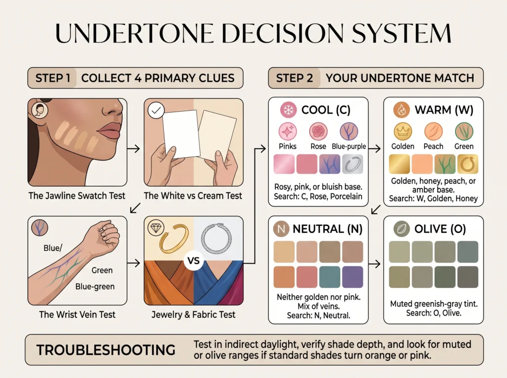
Recommended Decision Flow
- Start with similar-depth foundation swatches. Compare undertones in indirect natural daylight.
- If a shade matches well: Confirm depth and test over a larger area during wear.
- If no shade matches: Recheck depth, then compare muted, neutral, olive or alternative formulas.
- Use fabric and jewelry as optional styling clues. Do not force a category from conflicting results.
What to Do When Your Undertone Tests Disagree
It’s completely possible for your vein color, jewelry preferences, fabric comparisons, and foundation swatches to suggest different undertones. When this happens, don’t count the results as votes. Instead, use a practical shade-matching process.
- Step 1: Start with the foundation swatches. Compare warm, neutral, and cool foundations at approximately the same depth. If none matches, include muted or olive-friendly options where available.
- Step 2: Check the shade depth separately. A foundation may look wrong because it’s too light or too deep rather than because its undertone is unsuitable. Compare a slightly lighter or deeper version of your closest match.
- Step 3: Examine the swatches in consistent daylight. Compare your face, jawline, neck, and visible chest. Allow the products to settle before deciding.
- Step 4: Use jewelry and fabric comparisons as optional styling clues. They can help you explore which colors you enjoy wearing, but they shouldn’t override a foundation shade that blends naturally.
- Step 5: Make a practical decision. If one shade looks natural after setting and during wear, that’s a promising match even if your jewelry or vein observations suggest something else. If several shades remain close, try them over a larger area or seek a professional shade-matching consultation. You don’t need a perfect undertone label to find a foundation that works.
Quick Undertone Chart
This quick skin undertone chart compresses the guide’s decision rules into one reference. Practical clues, not absolute rules — no single row is a diagnosis on its own.
| Undertone | Color appearance | Foundation shades to explore |
| Warm | Golden, yellow, peachy | Warm, golden, neutral-warm |
| Cool | Rosy, pink, sometimes bluish | Cool, rosy, neutral-cool |
| Neutral | No dominant warm or cool influence | Neutral and slightly leaning shades |
| Olive | Greenish or muted golden-grey influence | Olive, muted, neutral-olive and suitable warm/cool variations |
These are common visual descriptions, not diagnostic rules. Foundation shade names vary across brands, and no single color characteristic confirms an undertone.
What Your Undertone Helps You Choose?
The verdict pays off beyond foundation. Start by comparing foundation shades at the right depth, then refine the undertone and formula. Brand labels can narrow your options, but the final match depends on how the product looks on your skin.
For color makeup, use the same temperature logic as a set of common harmonious starting points rather than fixed rules: peach and coral blushes and warm reds for warm undertones; pink and berry blushes and blue-based reds for cool; muted terracotta, dusty rose, and brick tones for olive rather than anything bright. Eyeshadow follows the same idea — warm golds and bronzes for warm, cool taupes and silvers for cool, muted dusty shades over bright pastels for olive.
Each of these gets its own deep dive later in this series — the blush, lipstick, and eyeshadow guides build directly on the verdict you reached here.
FAQ
Conclusion
Finding your skin undertone isn’t about making every home test agree. Start with foundation shades at the correct depth, compare different undertones in indirect natural daylight, and evaluate how each formula looks after setting and during wear.
Use jewelry and fabric comparisons as optional styling clues, not final answers. The goal is to find a foundation that blends naturally with your complexion, even when its undertone label isn’t what you expected.
